
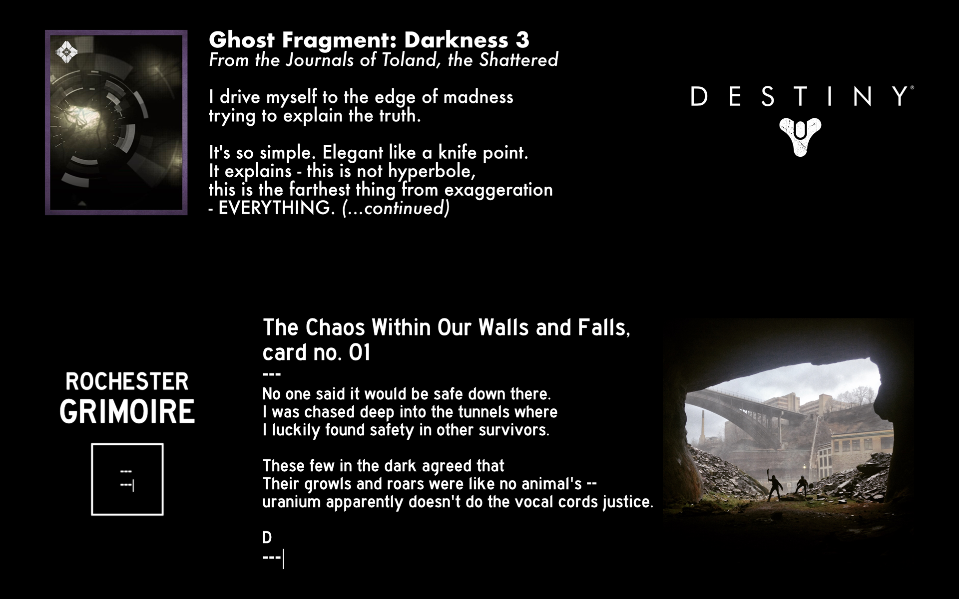
The use of grimoire cards as an art style was directly inspired by those unlocked in Bungie's Destiny (2014), a fascinating means of disclosing the deeper lore of that fictional universe. On January 4th, 2015 I shot and edited the lower-right photo with a 5th generation iPod Touch. My good friends Collin and Fiona were in awe at the dramatic scene we'd created – I eagerly wrote a caption to match and without realizing it, a lifestyle was born. I've since produced 100+ grimoire cards, each with individual intention, and categorized them into different 'series' of grander intention and theme.
All grimoire cards are organized on the Rochester Grimoire site at https://rochestergrimoire.com/
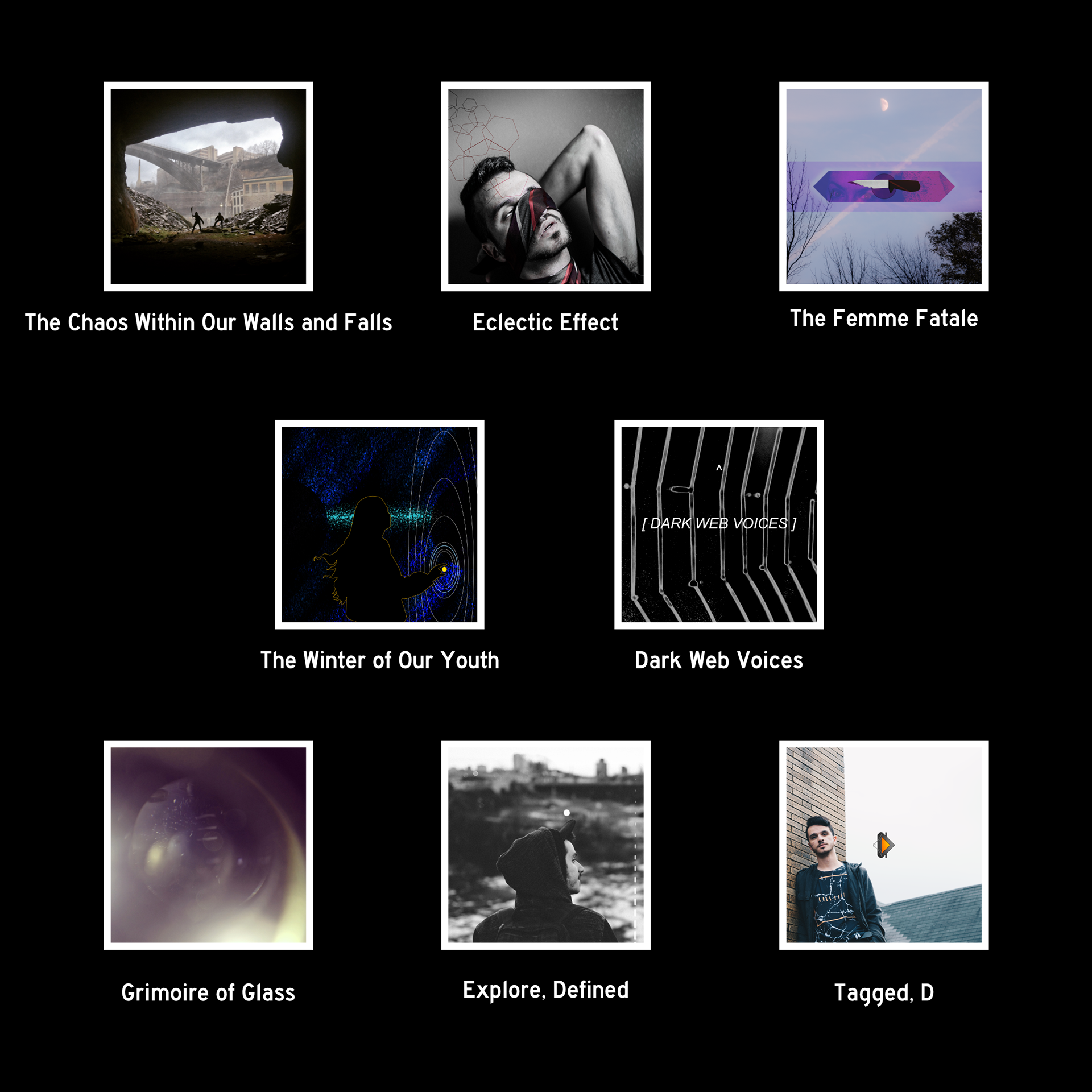
Each grimoire card is considered a work of its own first, then placed alongside related cards. Each series is backed by specific intentions and themes overall. Each series can be considered a 'story' comprised of 'parts,' though Eclectic Effect is a special case. Click a title below to learn more (under construction):
The Chaos Within Our Walls and Falls is the survey of a proposed universe, centered on an altered, chaotic Rochester, NY.
Eclectic Effect is a miscellaneous series of inspired poetry, fiction, and non-fiction, some of which relate to each other in 'parts.'
Dark Web Voices is a meta RG series exploring identity through the lens of narrative voice.
The Winter of Our Youth is a memoir-in-progress to archive and resolve my formative years of 2013 and 2014.
Explore, Defined is my perspective and experience in exploring Rochester, written for the #ExploreRochester community. This series is complete.
Tagged, D is about my own growth and story – because introspection is important.
The Femme Fatale is a survey of the aforementioned archetype through a variety of lenses.
Grimoire of Glass is a collection of experimental cards written as Destiny fan-fiction, per the project's roots.
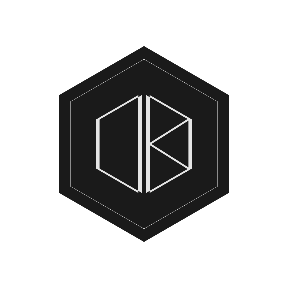
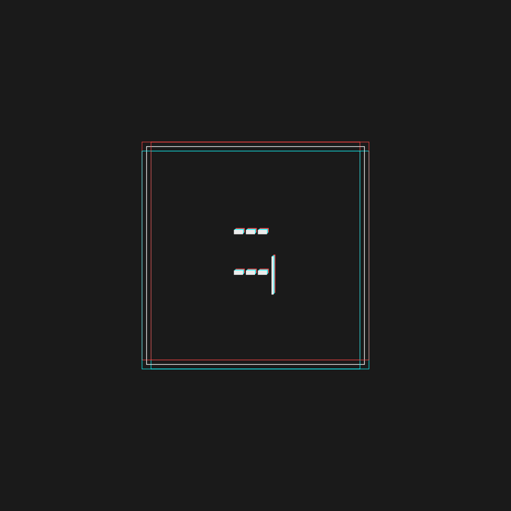
The Chaos Within Our Walls and Falls card no. 1 served as the project's interim logo until September 2016. I set and met a variety of criteria in order to represent Rochester Grimoire. I've detailed such extensive design philosophy at this page. In summary, the logo is a minimalist homage to squares in mobile interface design; HTML tags; and the project's roots in formatting. It represents the story told through a specific yet malleable lens, the square.
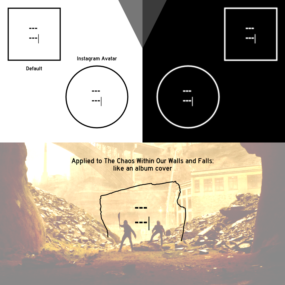
Logo variations; the hyphens and pipe stay as they represent the story and grimoire itself, while the square is the malleable frame, adaptable to any lens of storytelling.
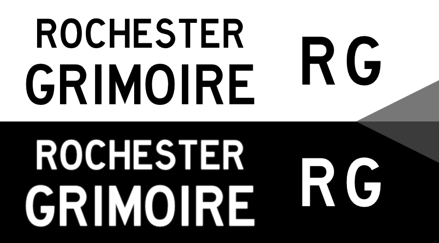
Wordmarks / Initials

Highway Gothic FHWA Series D serves as the project's main typeface. As designed by the United States Federal Highway Administration, I appreciated its high legibility and sharp, sans-serif nature. I wanted to utilize a font people will have seen in the city and on the expressways, as Rochester's urban setting fueled the project's growth. It's bold and loud without being overbearing, keeping in line with Rochester Grimoire's subtle and often-authoritative literary voice. All major branding & copy use Highway Gothic.
RochesterGrimoire.com additionally uses DIN Next Light, a similarly simple typeface optimized for the majority of sitetext including grimoire text.
In July 2016 I happily upgraded RochesterGrimoire.com to better fit my original vision. Inspired by Destiny's grimoire viewing experience on bungie.net and in their mobile app, grimoire cards are categorized by series from the home page, then listed in a grid. Clicking a card opens a side panel which displays the grimoire text, with any additional footnotes at the bottom. Mobile compatibility was a primary focus and desire here as consumers rarely ever browse on a desktop anymore, especially as referred by social media sites.
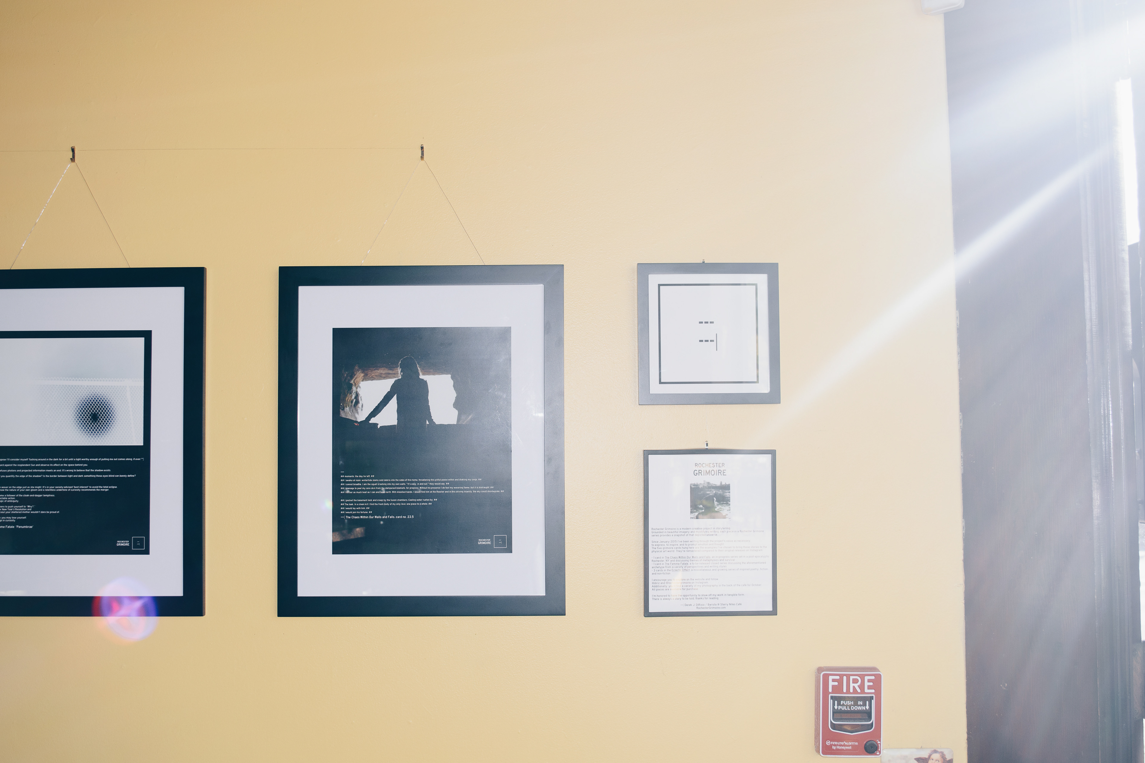
In October 2016 I held the first official Rochester Grimoire gallery at Starry Nites Café. I remastered and formatted five previously written cards for print as 11x14s matted to 16x20. Two of the five cards sold at opening night, proving to me the project's potential worth in Rochester's art community.
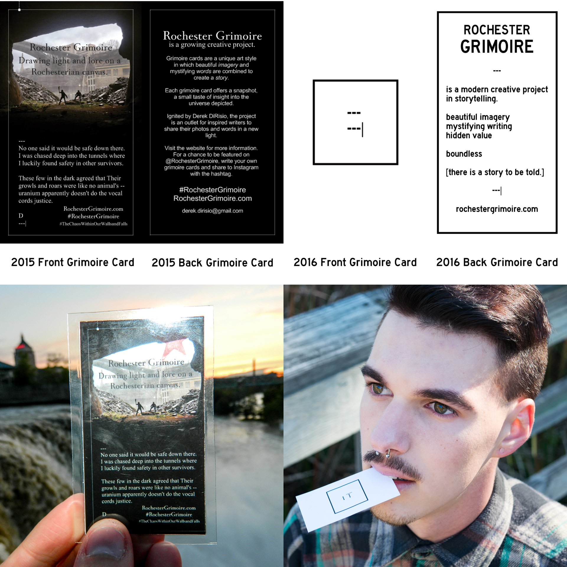
Additionally, I've created two versions of a 'concept grimoire card,' both which have served as business cards, of sorts. 2015's design brought the concept to the physical world for the first time with basic cards printed, some of which were laminated and hand-cut by me as gifts. 2016's design exhibited rebranding & professional cardstock; this card is more efficient in giving the gist of the project while also providing an example of what to expect. With this combination, the other side is free to viciously grip its viewer with the minimalist logo.
2018 Logo Redux
As of 2022, Rochester Grimoire is "parked" and dormant. Just prior to the odyssey, I shared four blog posts restructuring the catalog and putting to rest unfinished projects.